Brand Identity, Communication Design, Website
Overview
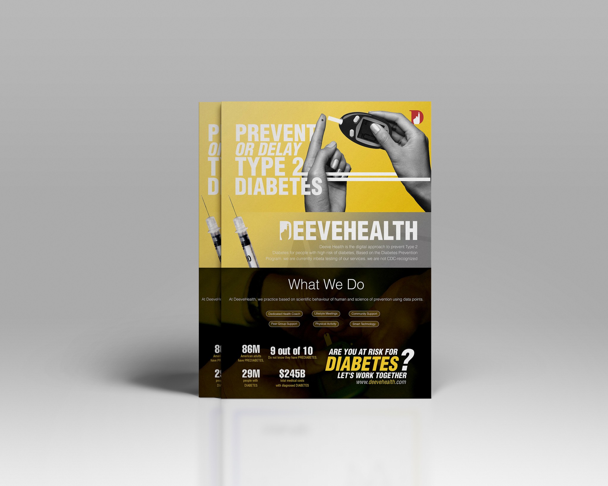
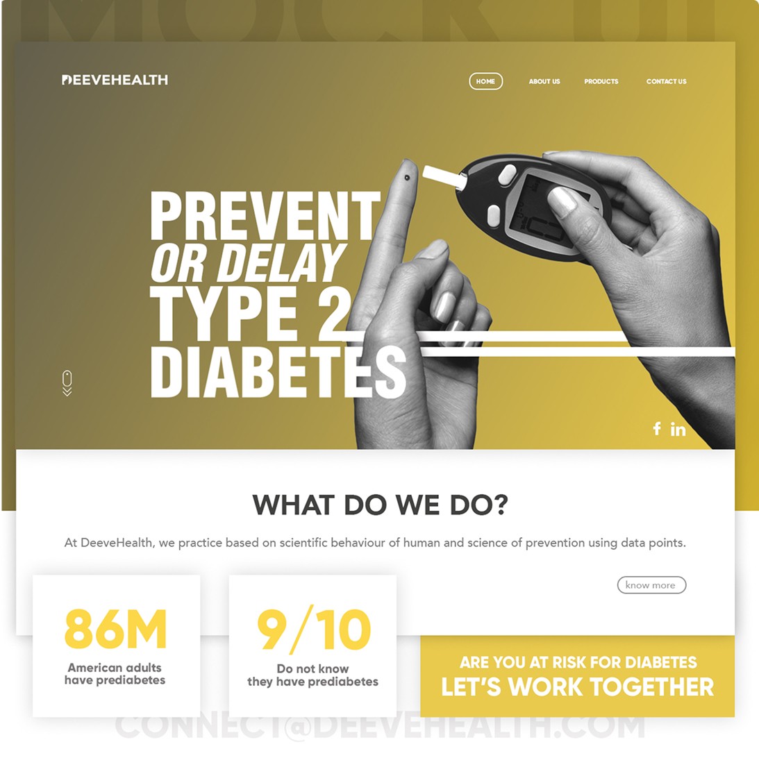
DeeveHealth prevents or delays Type 2 Diabetes for people who are pre-diabetic using a mobile solution in a combination of behavior psychology with strong peer group support, wireless device, and health coach.
Background
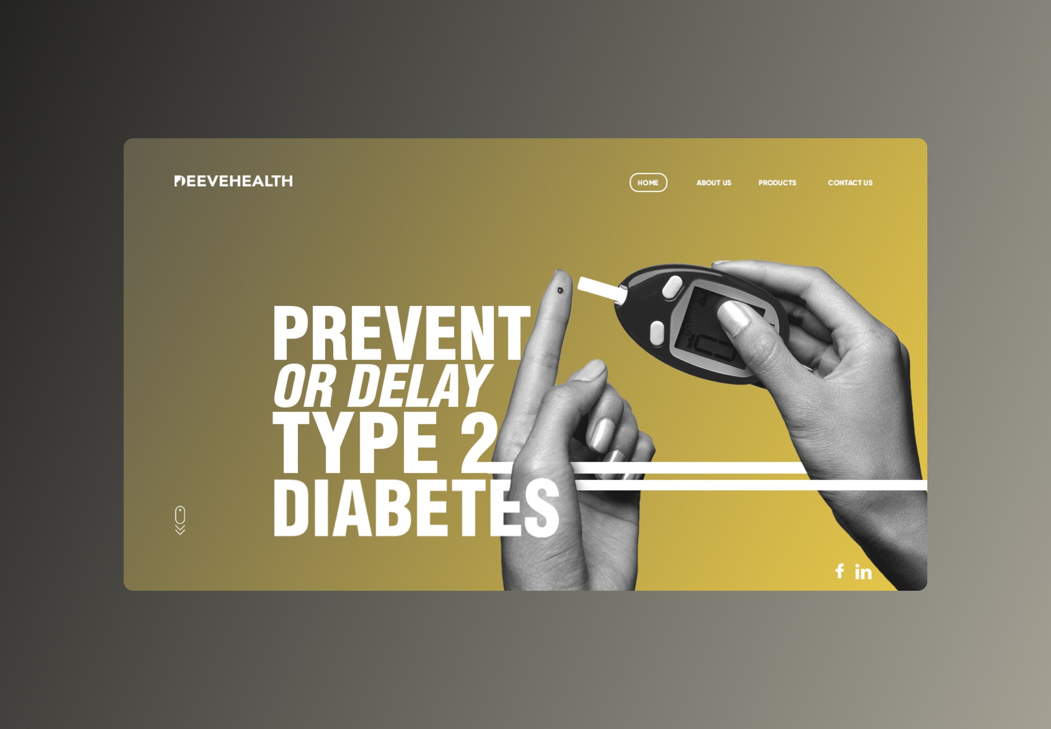
To support DeeveHealth's goals, there was a need for well-crafted design deliverables—including a user-centric website, a modern and meaningful logo, and informative yet motivating flyers—that reflected the brand’s scientific foundation and supportive community-driven approach.
Solution
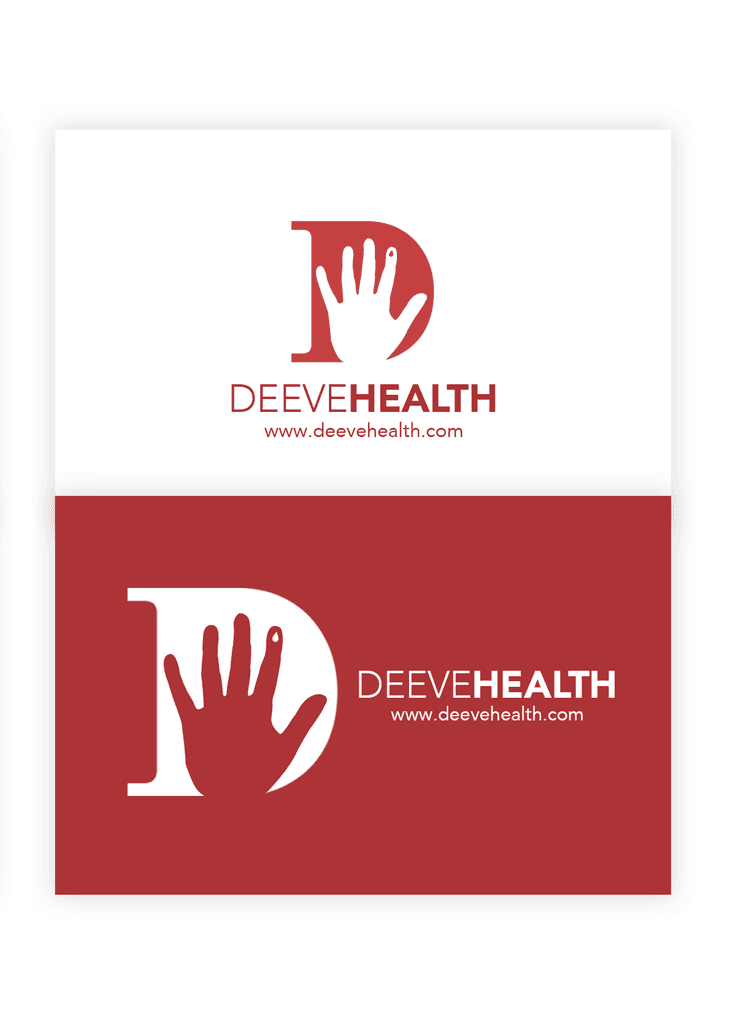
To address DeeveHealth’s branding and outreach needs, we designed a clean, responsive website that clearly communicated the program’s benefits, integrated behavior-tracking tools, and encouraged peer support. Alongside, we created a distinctive logo that represented balance and health transformation. Finally, we developed print-ready flyers that were informative, visually appealing, and actionable—serving as a tool for both awareness and enrollment. These deliverables positioned DeeveHealth as a trusted ally in the prevention of Type 2 Diabetes.
Brand Identity
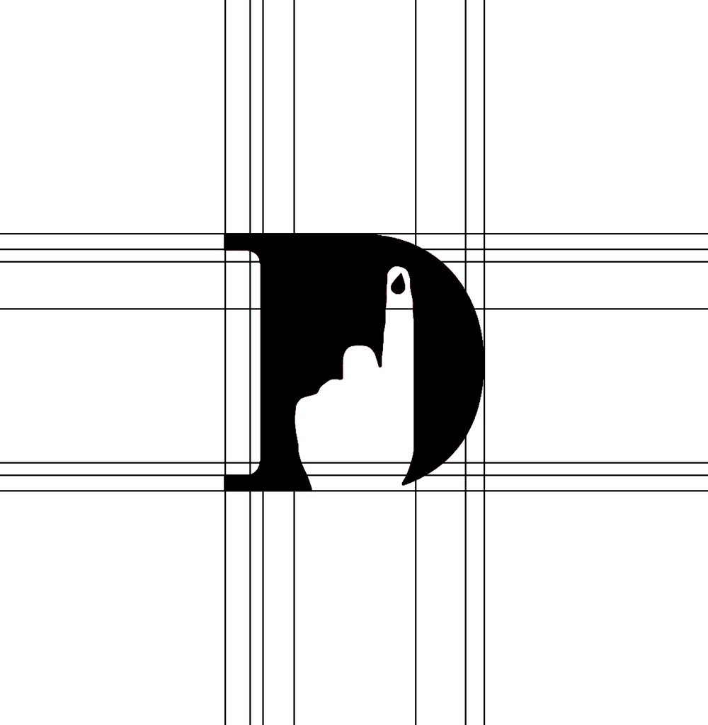
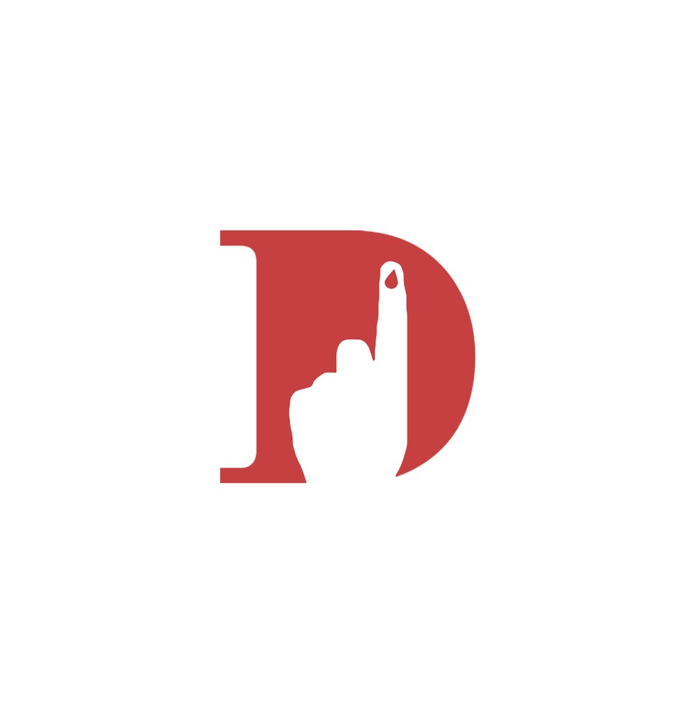
The DeeveHealth logomark features a bold red letter D, symbolizing both the brand name and its core focus—Diabetes. Integrated within the D is a subtle silhouette of a finger with a blood drop, a clear and recognizable reference to blood sugar testing. This simple yet powerful visual element conveys the brand’s mission of early intervention and awareness, combining medical relevance with a clean, modern aesthetic that evokes trust and urgency.